Company: Verizon
My Role: Experience Designer
Timeline: 3 months
Platform: Mobile & Desktop web
Status: Shipped


Context
Fios plan management is the self-service experience for existing Verizon customers to modify their internet, TV, home phone, and entertainment perks.
In theory it’s a straightforward task. In practice, customers were abandoning at every step: 87% before the cart, another 41.5% right before submitting their order. Only 7.5% made it through. This project set out to understand why, and rebuild the experience from the ground up.
dropped between the plan page and the cart, the critical decision point.
abandoned at the final step, where unexpected fees appeared.
end-to-end conversion from plan page to completed order.
Business KPI
Reduce the churn.
Reduce call volume driven by self-service failures.
Reduce transaction time.
Service expansion (perks, home security).
Improve upgrade and migrations.
Customer verbatim
“I'm in this 'Manage Plan' section, and I'm totally lost. It's not clear at all where to go. I would probably just give up and go to the chatbot or call customer service.”
CMI research
“The current plan change feels like starting a new purchase journey, instead of building and learning from their existing plan.”
CMI research
“Your website is an abomination. Incomprehensible mess of pages. Literally nothing is working on it. Impossible to navigate!”
“In 1999, this would have been a good website.”
Voice of customers
From a mindset of
“I'm in this 'Manage Plan' section, and I'm totally lost. It's not clear at all where to go. I would probably just give up and go to the chatbot or call customer service.”
CMI- E2E Benchmarking study, 2025
To a mindset of
Where the users are profoundly understood, fostering a predictable, meaningful, transparent and trustworthy transaction.
My role & key contributions
Across a project spanning 160+ use cases, I designed a major share of the end-to-end solutions from concept through validated, development-ready flows. Here are some highlights:
Internet upgrade & downgrade flows
Designed the core use case end to end: smart hub through plans, cart, and checkout.
TV flows
Owned the most technically complex domain of the project. Transformed a confusing legacy flow into a simplified, step-by-step configuration experience.
First-time service additions
Designed how customers add new services, a direct line to the business's expansion KPI.
Continuous UX validation
Planned and executed 5 usability tests (UserTesting), gathering rapid qualitative feedback to iteratively refine high-friction touchpoints.
Collaboration & facilitation
Facilitated cross-functional workshops and worked daily with business, content, research, and engineering to align user needs with business goals.
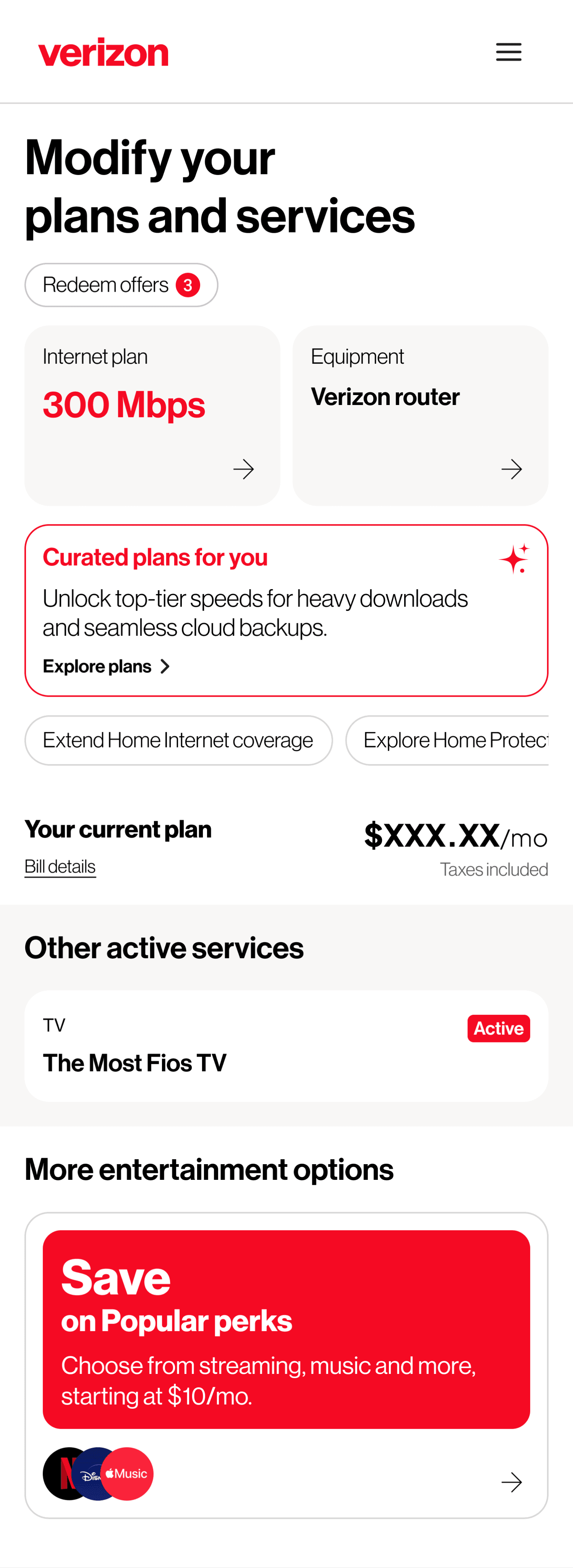
The smart hub, a focused starting point
Designed the hub as the customer's home base: current plan and equipment at the top, primary actions as unmissable entry points, and services they haven't added yet surfaced below - visible, but not competing with what they came to do.
This solves:
Lost customers with no clear entry point.
“Personalized” tiles dismissed as ads.
Promotional content crowding account details.
Internet plans
Plans are presented with one goal: confident decision making. A Smart Tip explains the recommendation in plain terms based on real usage, not guesswork. Every card shows the same details in the same order, so comparing options takes seconds, not scrolling and second guessing.

Equipment plans
Equipment updates automatically based on the plan selected, no extra decision required. A quick before/after view shows exactly what's changing, with room to customize if needed.

Testing & iteration
The new hub-and-spoke design provides a strong foundation for confident decision-making through clean layouts and easy, digestible comparisons.
A second CMI study put mobile wireframes of the two riskiest flows in front of ten customers and prospects in moderated interviews, and I ran rapid spot tests on UserTesting between iterations.
Users responded positively to the compartmentalized hub-and-spoke layout, describing it as clean, uncluttered, and logically organized. They were able to quickly identify where to complete common tasks, such as changing their plan, expanding in-home network coverage, and finding their current bill.
CMI research
